Explore America’s History With These Richly Interactive Maps
“American Panorama” delves into the social, political and economic movements that define this country
/https://tf-cmsv2-smithsonianmag-media.s3.amazonaws.com/filer/63/aa/63aa6ab5-258f-4a9b-822e-47f5bfa4f4f9/screen_shot_2015-12-30_at_122341_pm.png)
Maps are more than geographic sketches of place—they contain stories. The wealth of digital tools available to mapmakers today means that these stories have now evolved to take viewers into the past, show changes over time and serve as detailed sources of information. The University of Richmond’s Digital Scholarship Lab is striving to push geographic storytelling even further with a new set of maps from its “American Panorama” project.
The lab teamed up with cartography firm Stamen Design to create an atlas that spans the shaping of America, writes Laura Bliss for City Lab. They have four maps available to explore now: “The Forced Migration of Enslaved People in the United States, 1810-1860,” “The Overland Trails, 1840-1860,” “Foreign-Born Population: A Nation of Overlapping Diasporas, 1850-2010” and “Canals, 1820-1860."
The project was inspired by Charles Paullin’s, Atlas of the Historical Geography of the United States, originally published in 1932. That atlas uses almost 700 maps to cover many aspects that shaped the political, social, geological and economic boundaries of the country. Paullin’s editor, John K. Wright, commented at the time that “[t]he ideal historical atlas might well be a collection of motion-picture maps,” reports Jennifer Schuessler for the New York Times. The Richmond lab brought Wright's desire to life, digitizing Paullin’s atlas in 2013. With "American Panorama," the lab works to propel the spirit of the project further.
Panorama is a completely digital atlas, not just one converted to the form. “We don’t want it to be faithfully following the look of a historical atlas,” Jon Christensen, a historian at the University of California, Los Angeles and partner with Stamen, tells City Lab. “We want these to look like maps made in the 21st century.”
They do. As Bliss notes, the maps are dense, “like entire textbook chapters turned interactive tools.”
In the diaspora map, viewers can click on individual counties in each state, and trace the people living there in each decade back to their country of birth—often Ireland or Germany in the 1860s, Mexico in the 1990s and China for the West Coast in the 2000s. Historical notes explain the reasons for some of the shifting patterns. For example, the Immigration Act of 1965 allowed many more people from countries outside of western Europe to come to the United States.
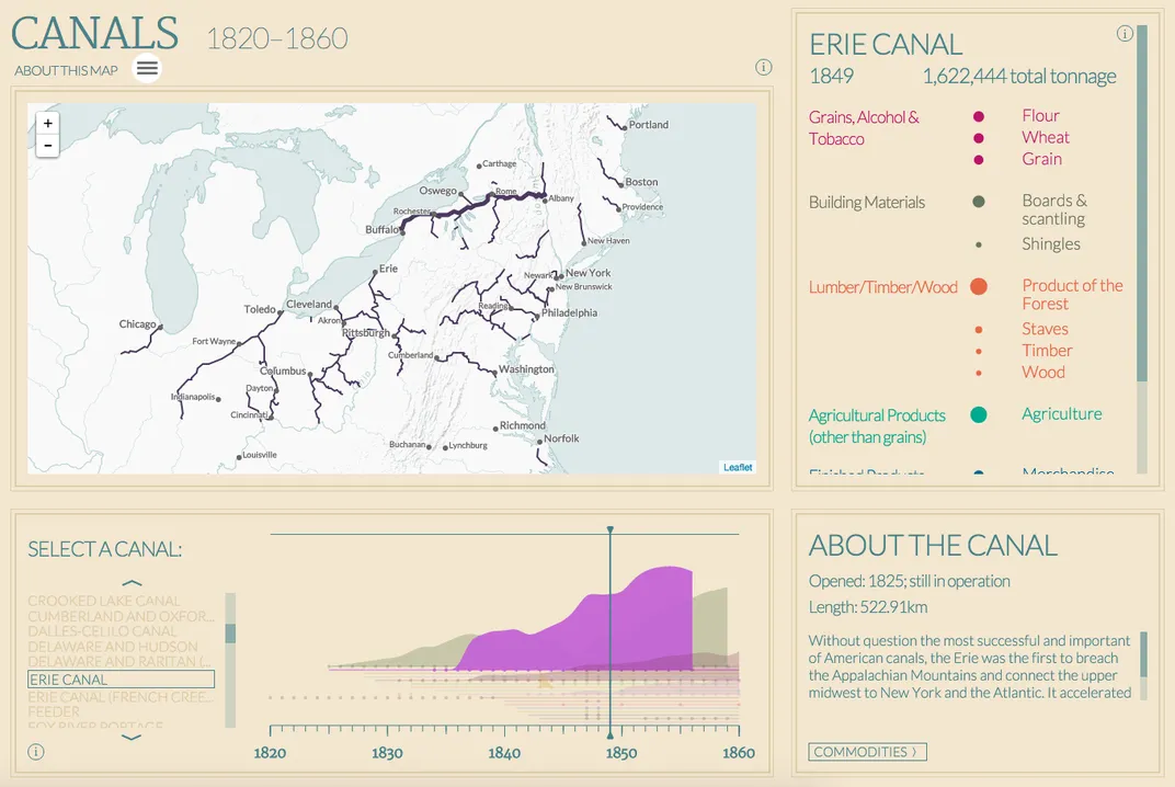
The Canals map traces not just the expansion of these waterways across the growing nation, but also the goods that traveled through the routes, from flour and wheat to timber and tobacco.
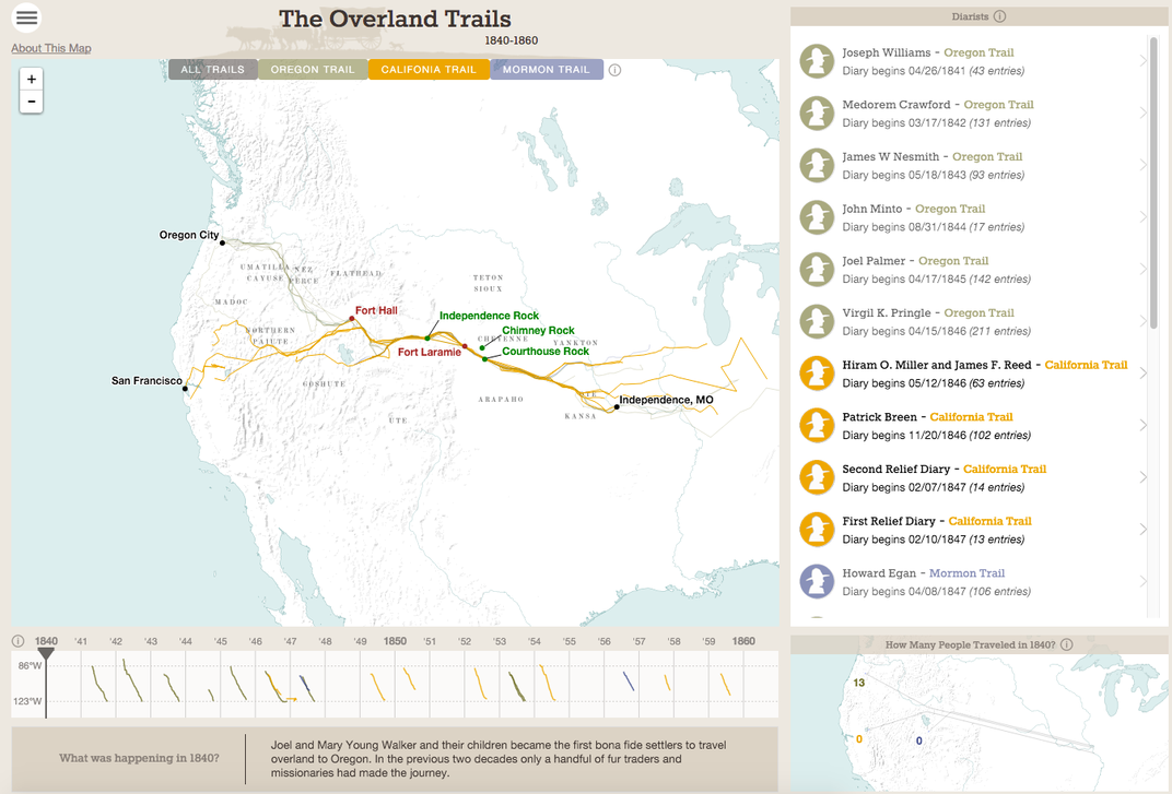
The Overland Trails map tracks how many people journeyed through parts of the United States each year, as well as providing context to explain the reason for the spikes and declines in travel. It also links to travelers' diary entries. These passages often record details on the weather people endured, and the company they kept on the road.
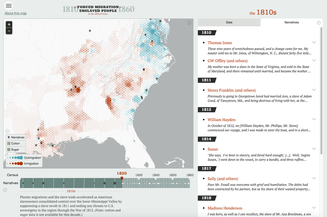
The map of forced migration tells the most powerful story through data and narration. While one tab alongside the map shows the number of enslaved people in each state by year, the other tab gives life to those statistics, through accounts by those forced into slavery.
The goal for the project is to aid scholars in making new historical findings, while also making the maps accessible for the general public, Bliss writes for City Lab. In the coming months, the team plans to add maps on redlining during the Great Depression, presidential voting and urban renewal in postwar America, among others.